Making Energy Count.
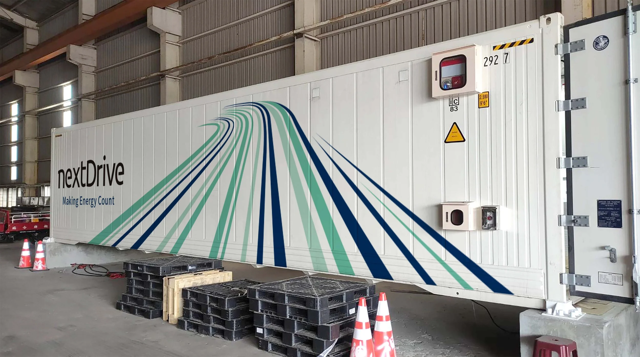
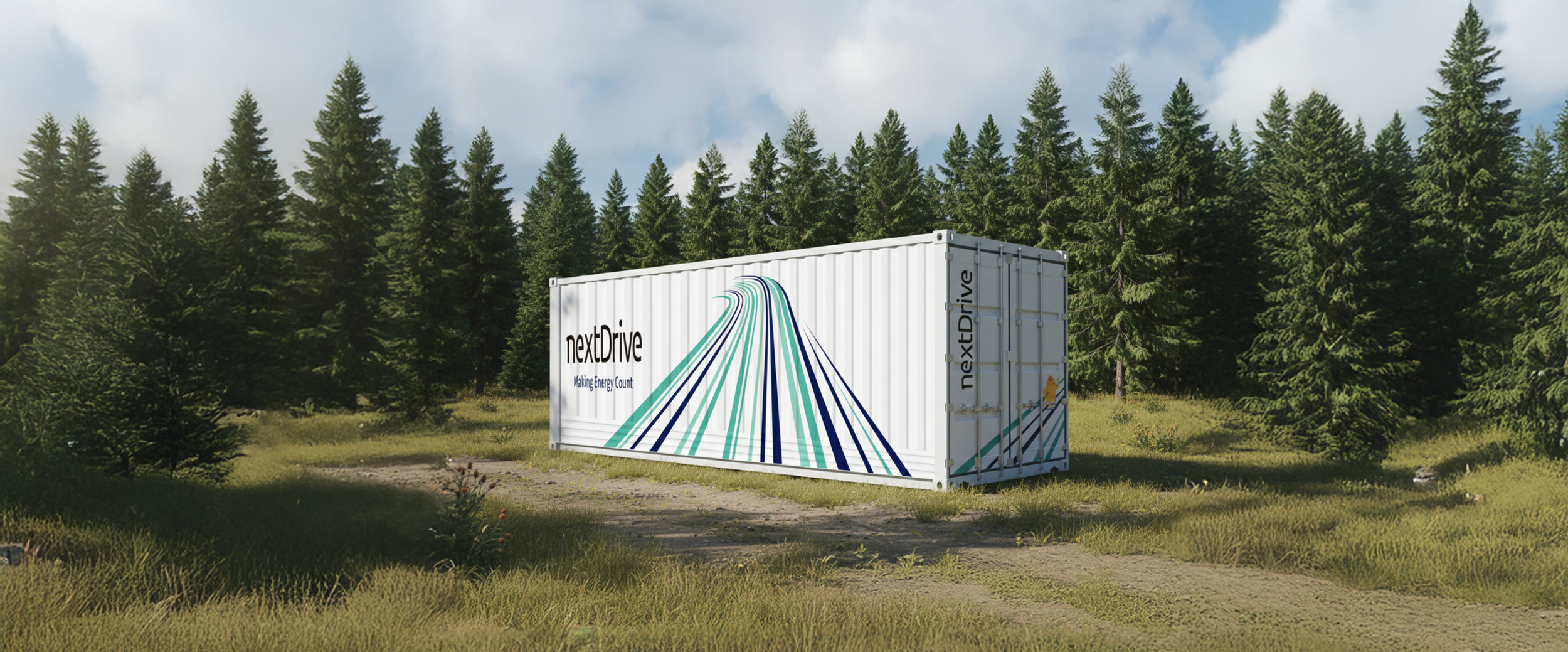
This project redefines the energy landscape through a forward-looking visual system for NextDrive. Since 2013, the brand has delivered integrated energy IoT solutions, enabling businesses and households to move toward digital and carbon-neutral transformation.
The design moves away from the cold, industrial language of traditional equipment. Vector graphics translate energy into dynamic forms, while layered blue and teal lines across clean white surfaces express speed and convergence.
Visual identity
Illustration
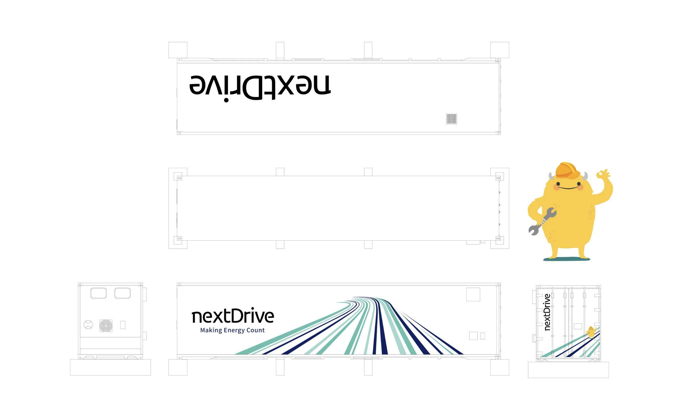
Playful mascots introduce warmth and accessibility, balancing the system’s technical nature while reflecting a spirit of exploration, change, and optimism.
By uniting precision with visual clarity, energy storage systems become more than functional objects, emerging as a distinctive presence that shapes a new visual identity for the net-zero era.