Glide in Color. Feel the Freedom.
C7skates draws from SoCal street culture, transforming skating into a vibrant mini-vacation. Through precise design, the brand establishes a modern, highly recognizable identity in the active lifestyle market.
Product color scheme design
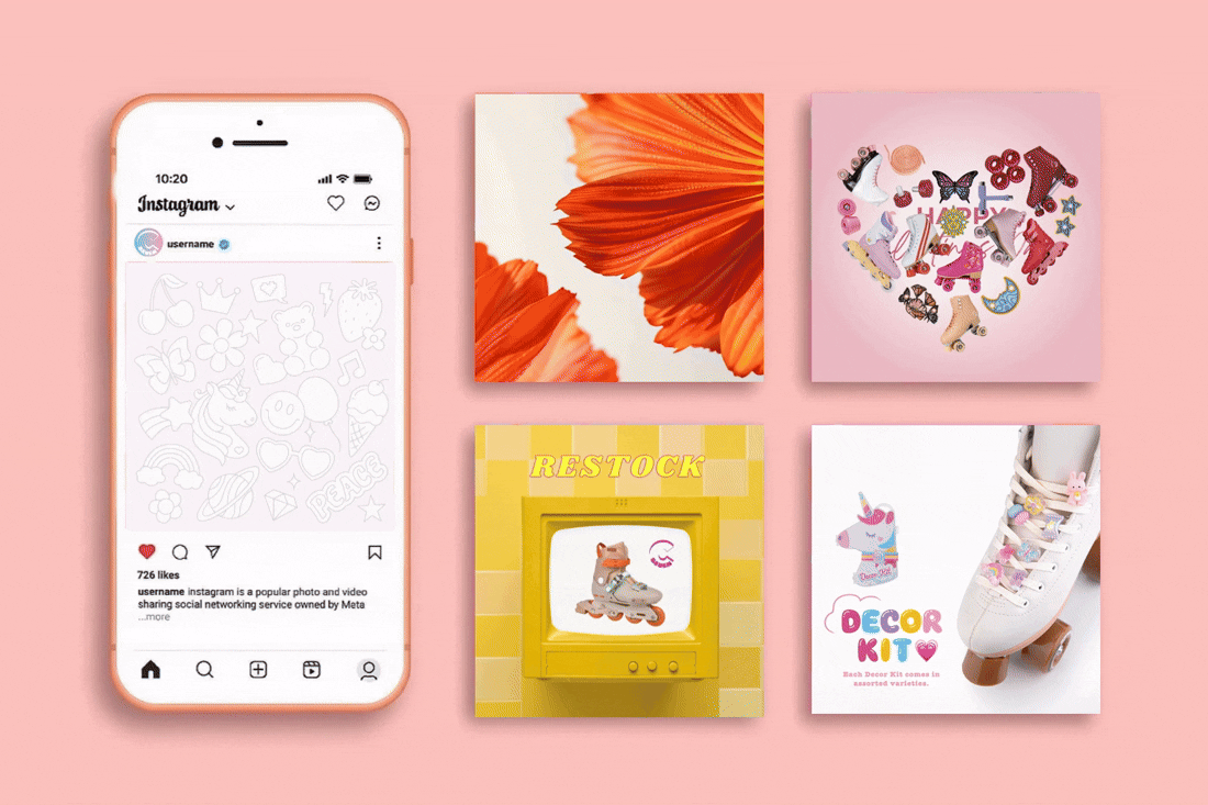
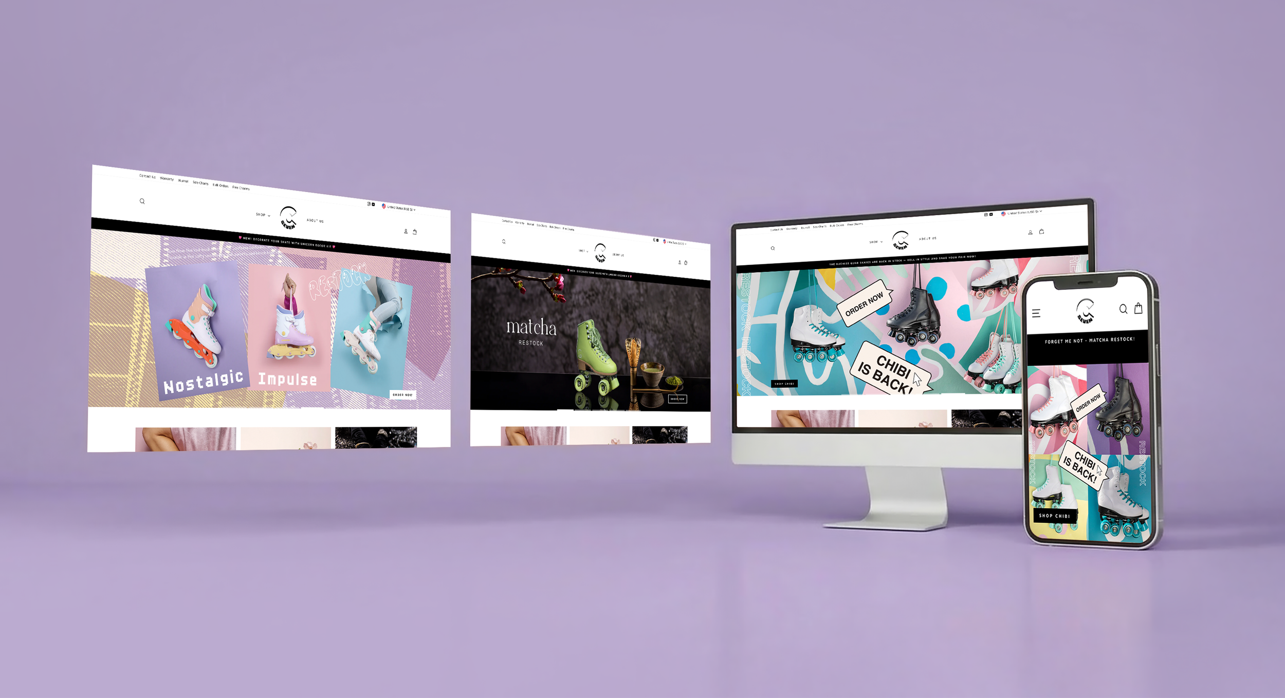
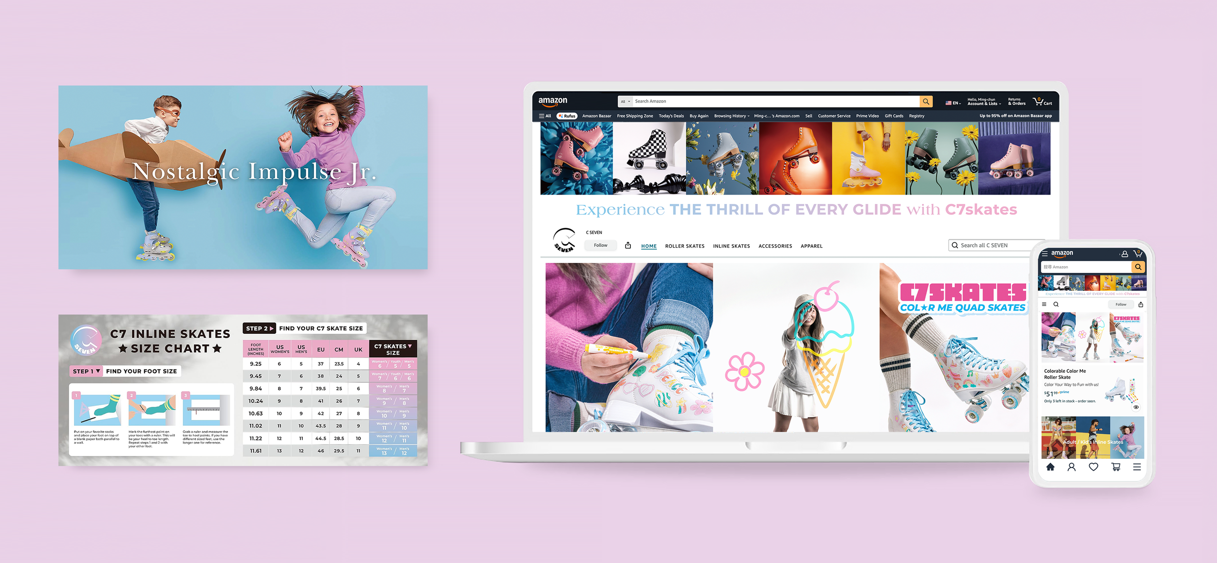
Digital & E-commerce Content
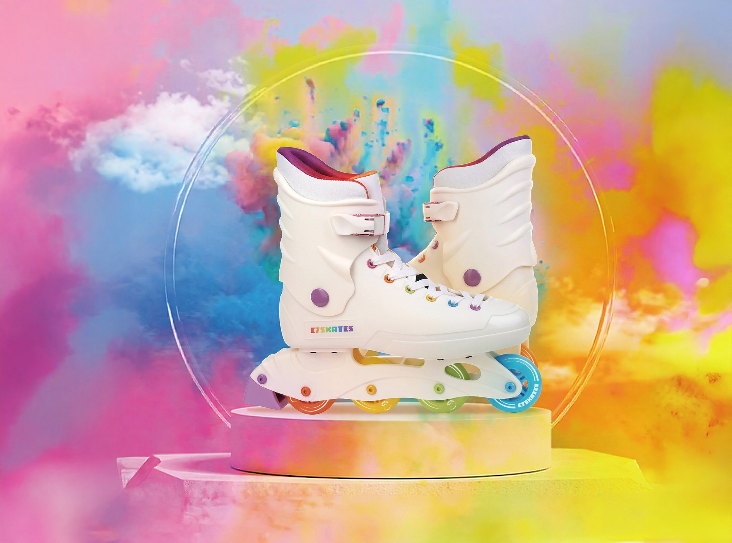
The Rainbow series uses bold gradients to express movement. A premium campaign with Marriott San Diego elevates the product into social contexts, enhancing digital reach and brand perception.
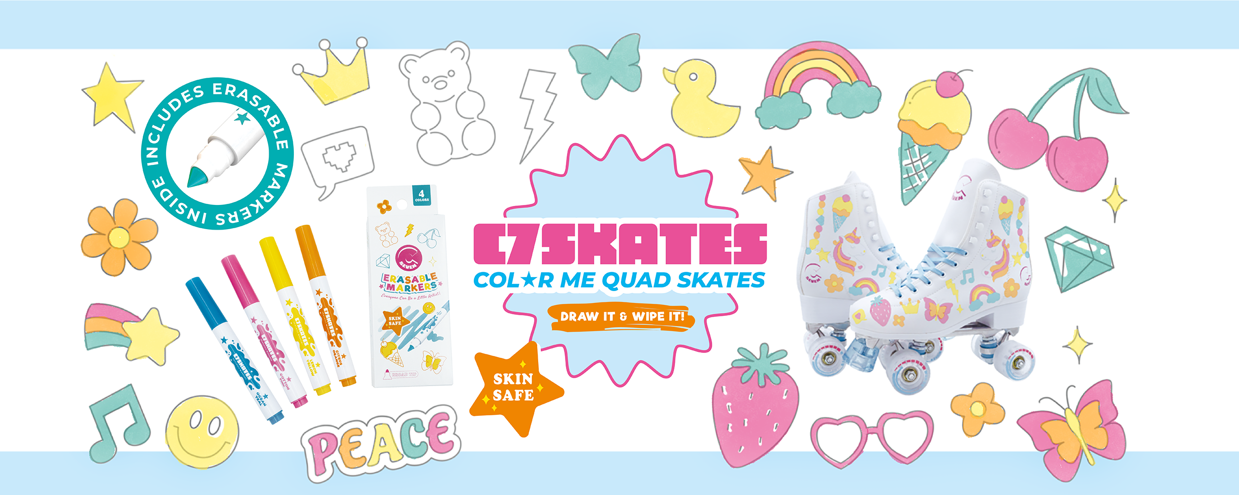
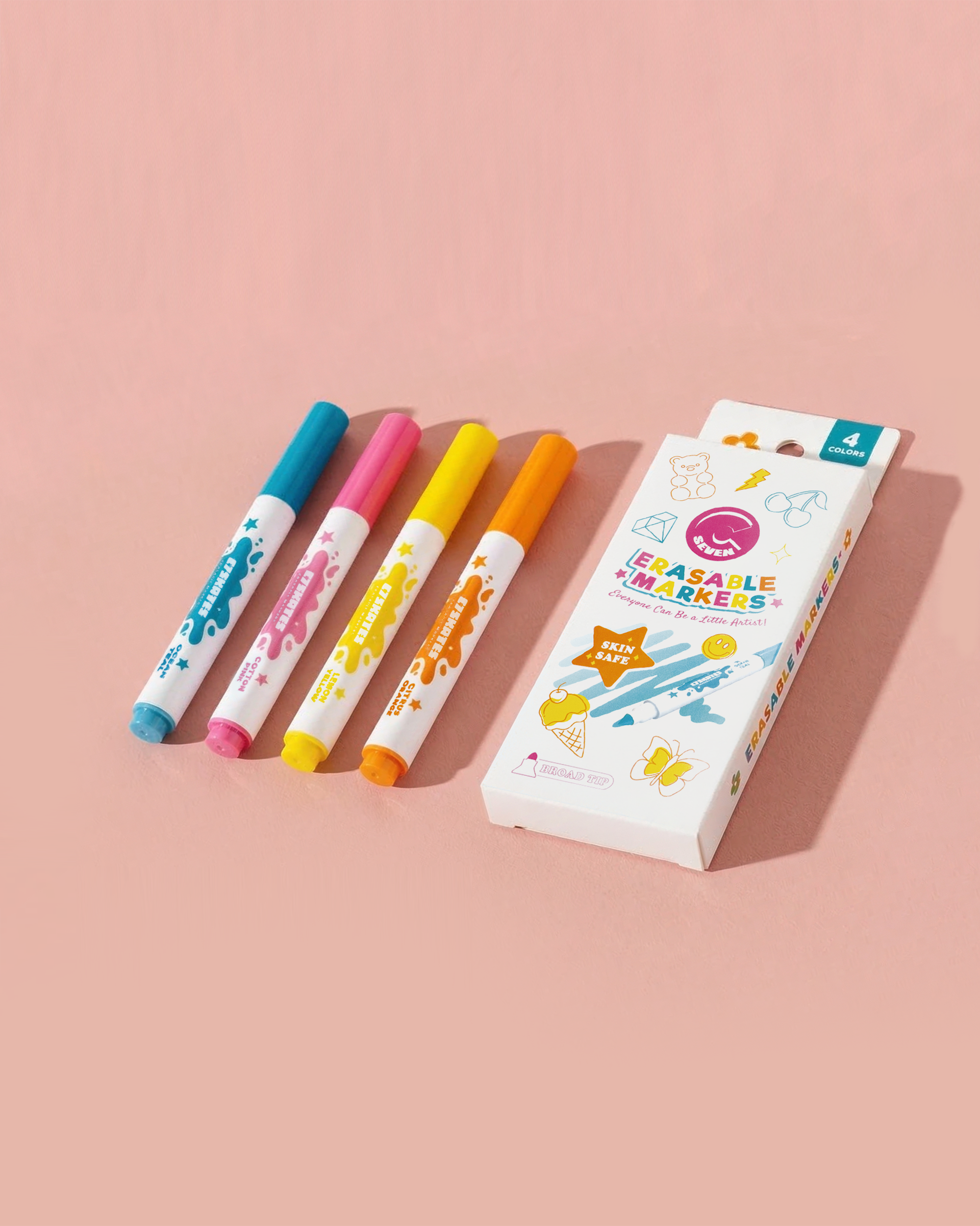
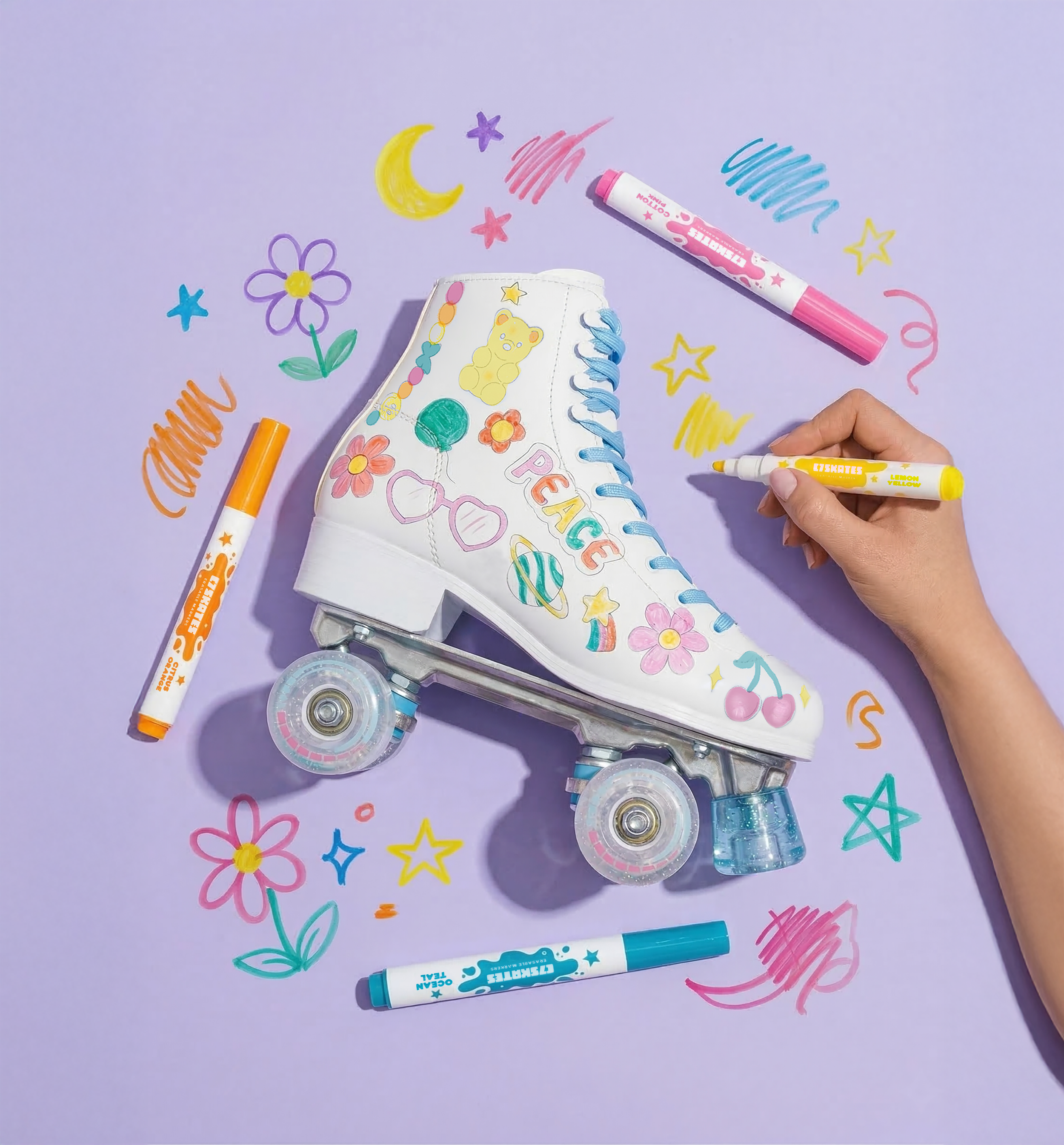
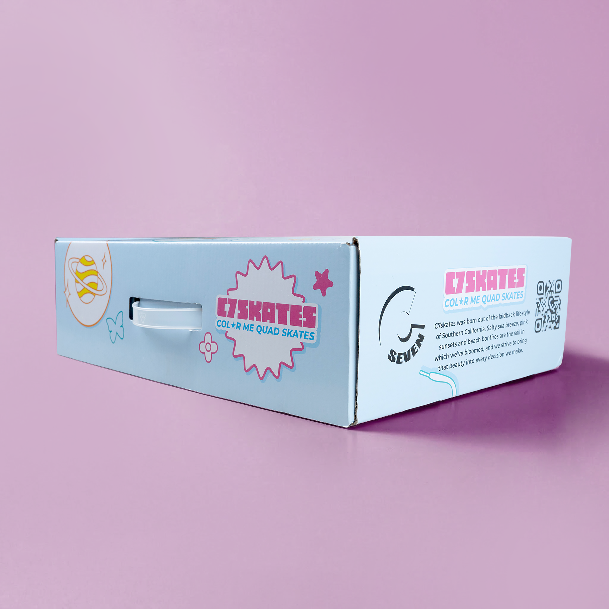
The Color Me series redefines skates as a creative medium. Featuring erasable markers and retro graphics, the design integrates product development with community engagement to strengthen user bonds.
Product pattern & color scheme design
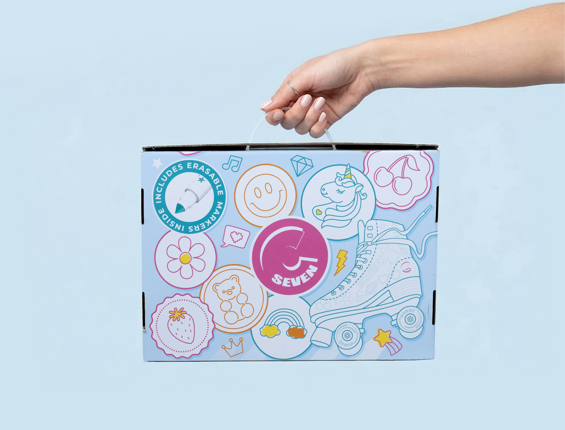
Packaging Design
Digital & E-commerce Content
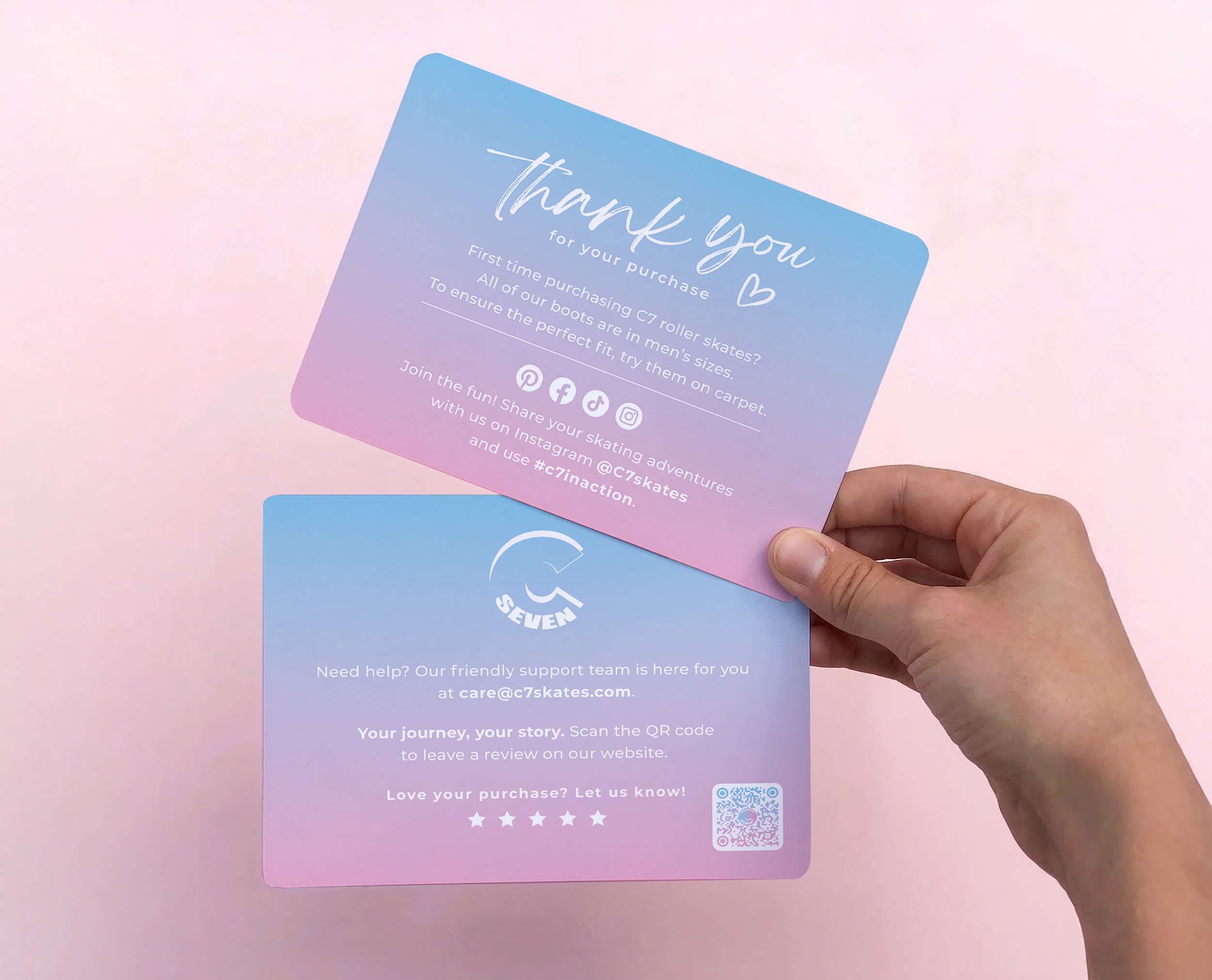
Visual consistency spans all digital platforms. Optimized Amazon content and AI-assisted workflows enhance information clarity while increasing production efficiency and reducing operational costs globally.