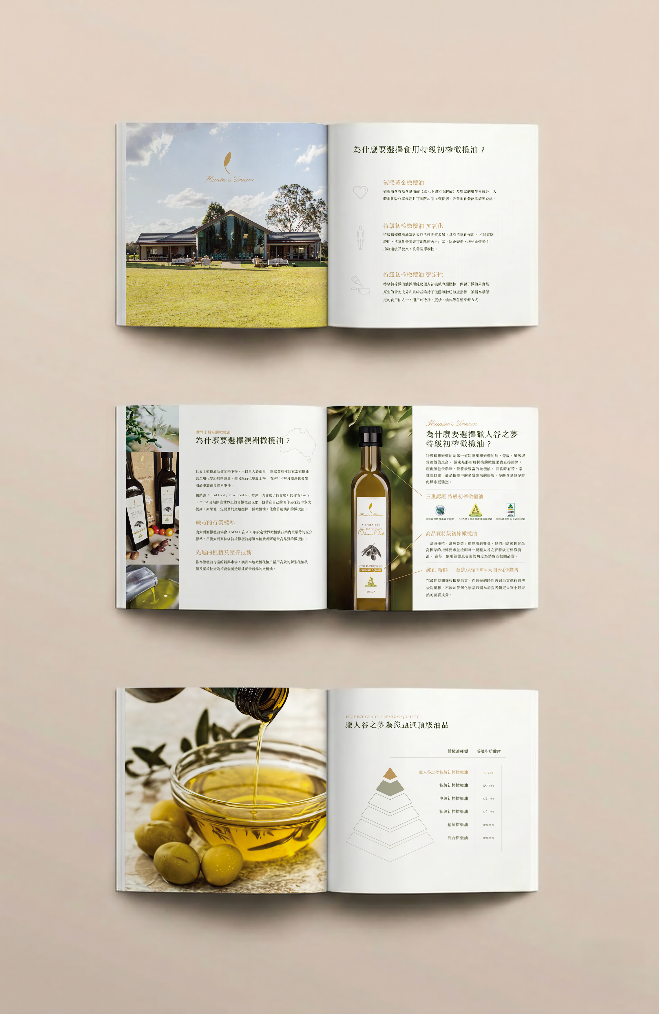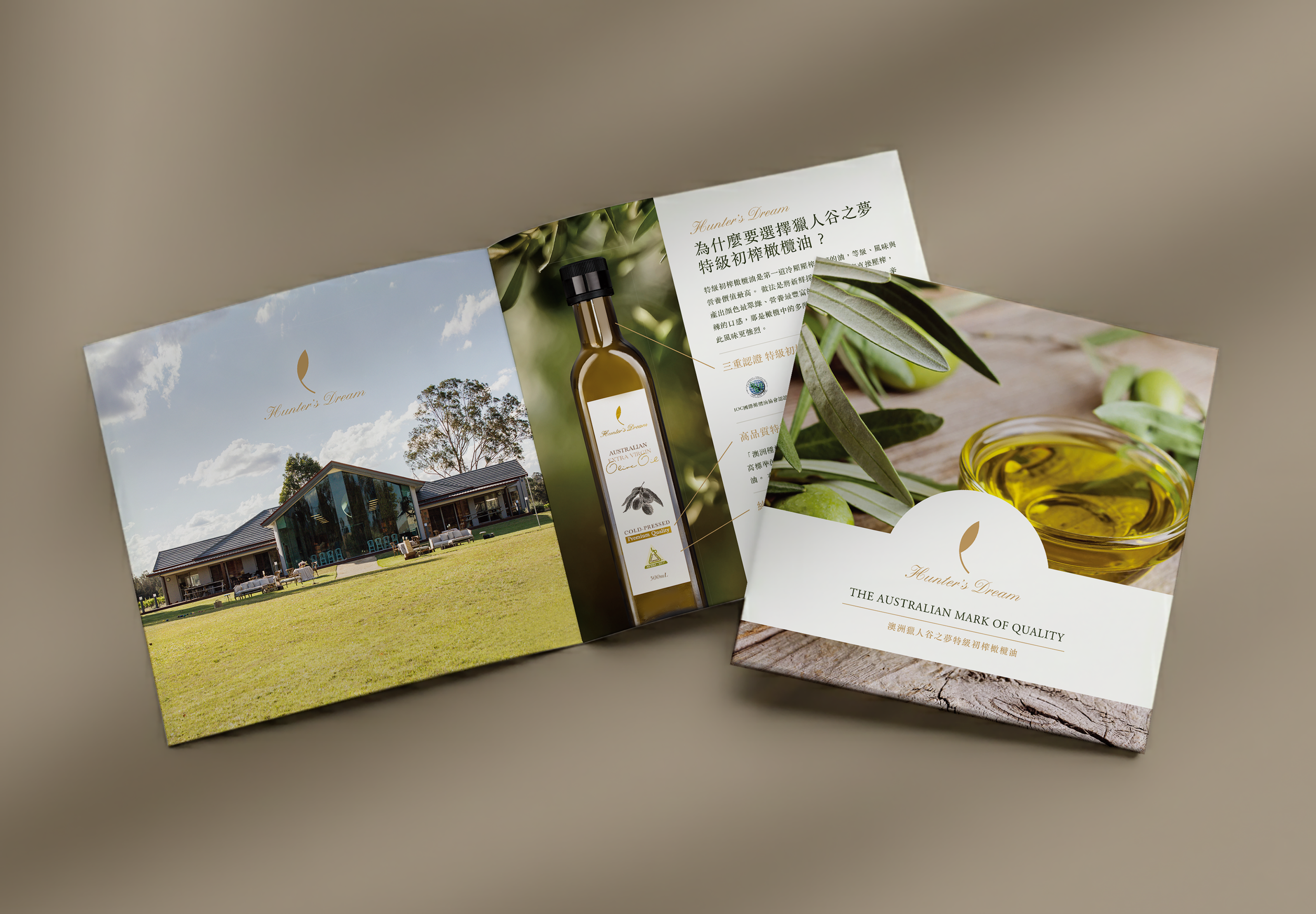
Brochure Design for an Estate-Quality Olive Oil Brand.
The brochure balances an “estate to table” narrative with a strong emphasis on quality assurance, pairing emotional storytelling with a clear and credible foundation. Generous white space and a restrained palette reflect the purity and professionalism of the Australian landscape, while on site photography captures a sense of freshness and care, showcasing olives harvested at peak ripeness and cold pressed within hours to preserve their premium character.
Technical details and production processes are translated into clean and intuitive diagrams, turning complexity into clarity without sacrificing elegance. Complemented by classic serif typography, the design seamlessly integrates emotive imagery with a rational structure, positioning Hunter’s Dream as a refined and authentically Australian brand.
Brochure design