

Translating Michelin-starred artistry into refined print textures.
Derived from an archaic word meaning "woods" or "small hill," holt symbolizes a return to natural roots. As a Michelin-starred modern restaurant, holt centers its philosophy on refined European culinary techniques blended with seasonal Taiwanese ingredients and diverse cultural inspirations. The style is pure, elegant, and inventive, dedicated to creating a nuanced and immersive dining experience within a minimalist setting.
Menu design
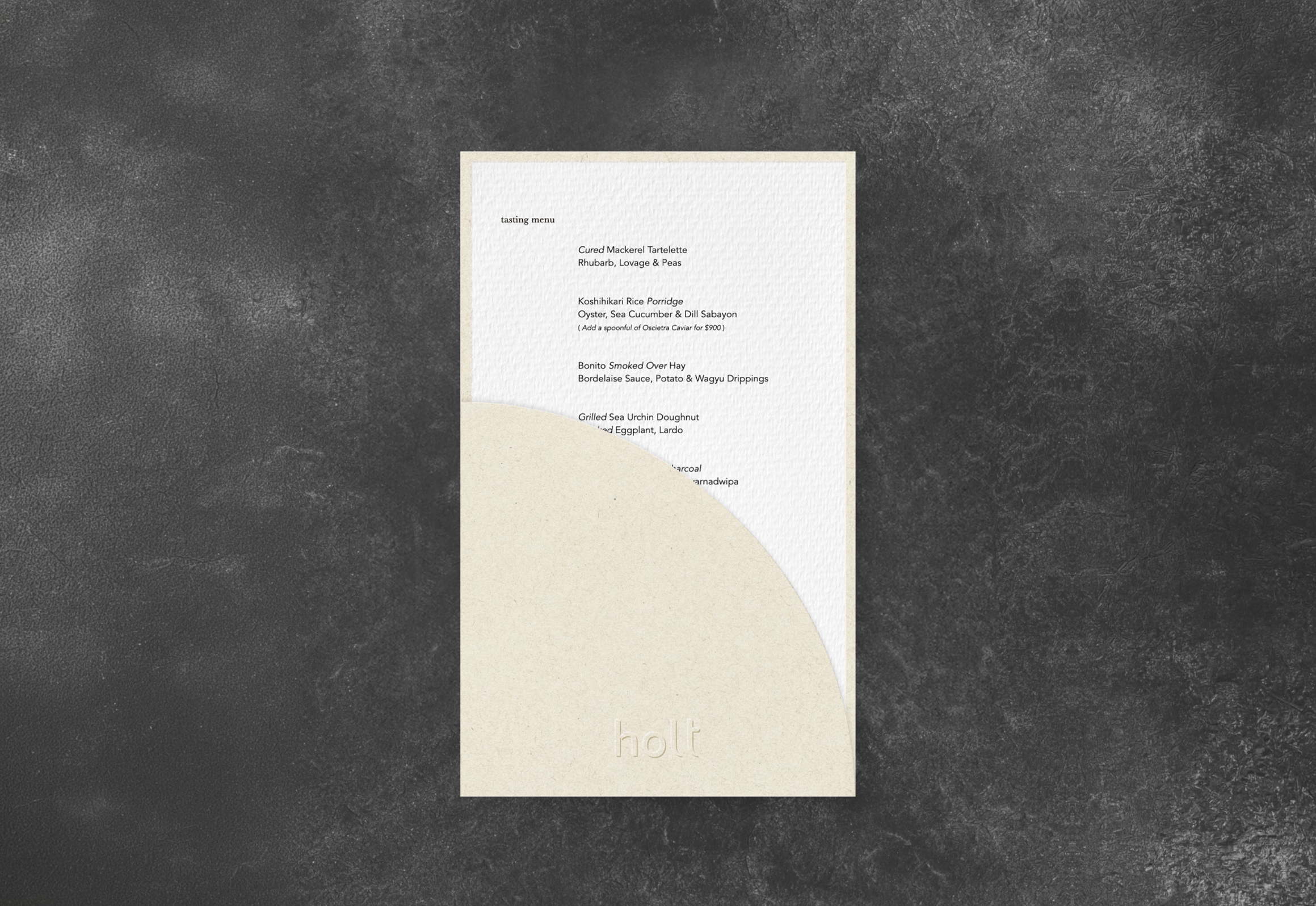
The Tasting Menu
For the Tasting Menu, the design strategy focuses on understated yet sophisticated sensory interaction. The outer sleeve features an asymmetrical arc cut paired with precision embossing, creating a rhythmic play of light and shadow against a minimalist cream palette. This approach gives the paper a three-dimensional, tactile warmth, allowing guests to feel the commitment to every dining detail the moment they touch the menu.
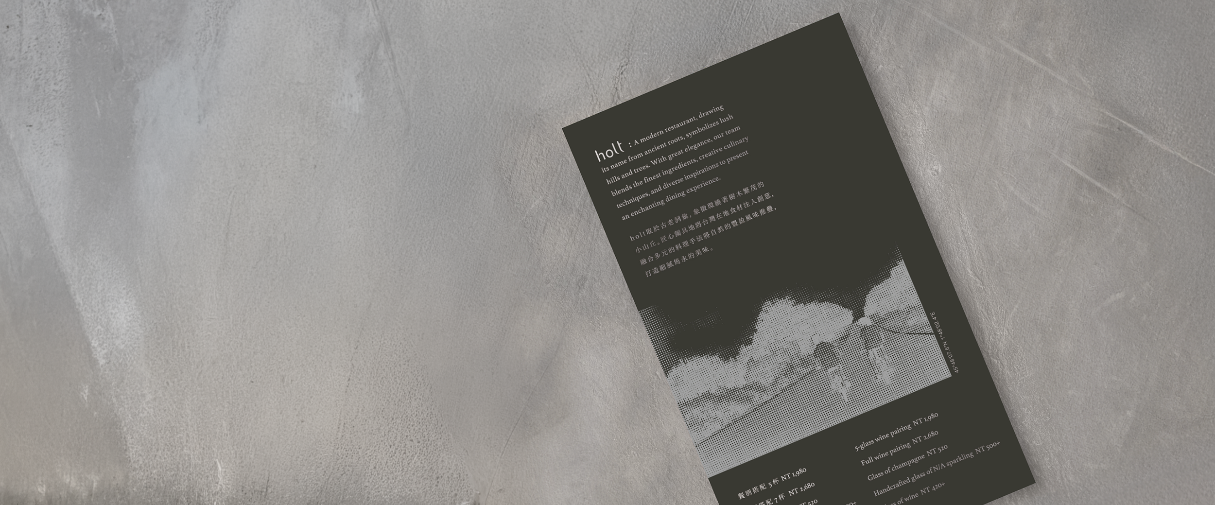
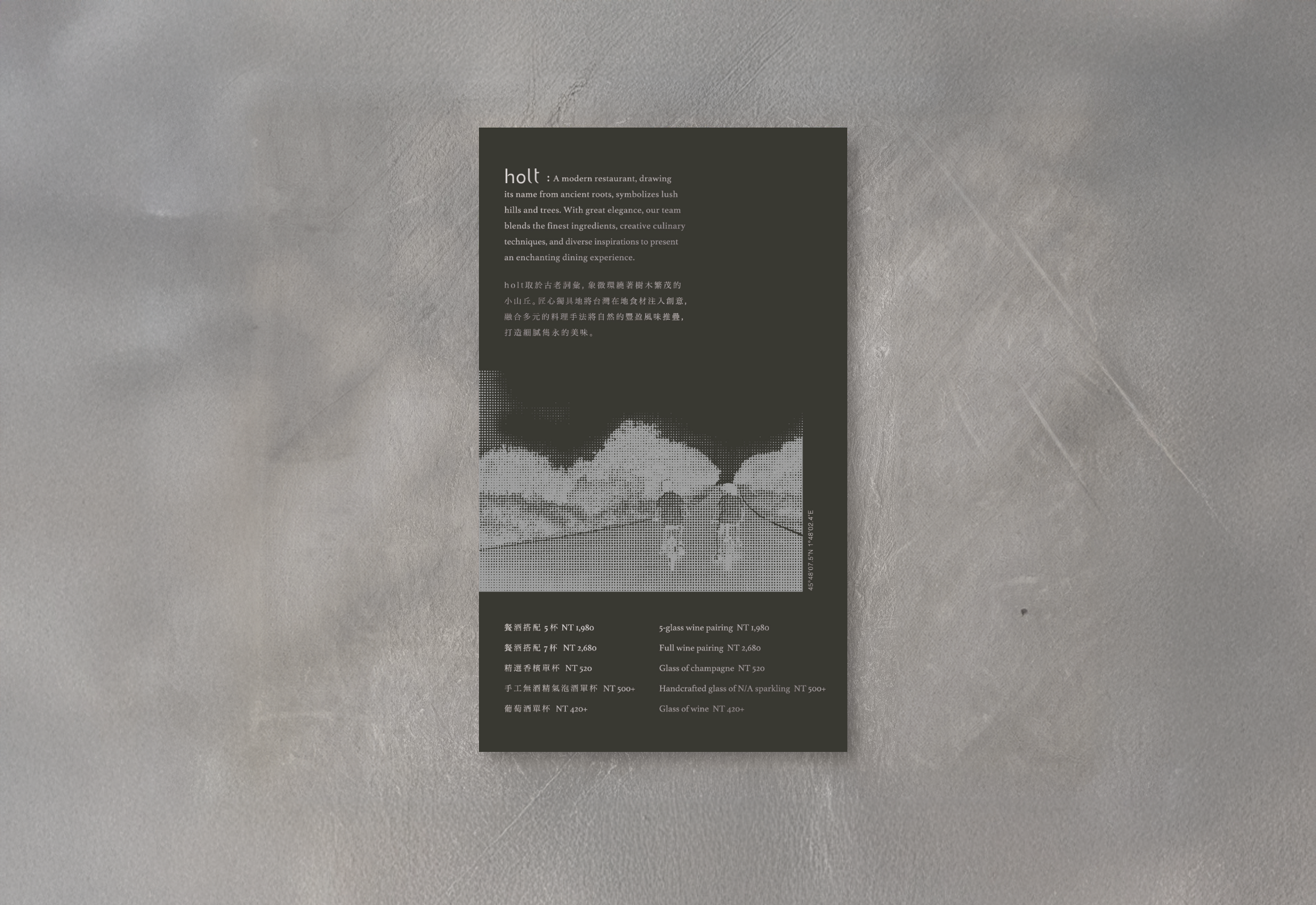
The Wine Pairing Menu
The design for the Wine Pairing Menu centers on a visual experiment with photography. Through halftone digital processing, landscape imagery is transformed into a granular artistic expression, seamlessly integrated with matte silver ink and fine paper textures. This subtle technique allows the images to reveal dynamic shifts in light and shadow from different angles, precisely echoing the chef’s meticulous layering of flavors and extending the overall dining experience into the depths of visual and tactile artistry.