Bringing Australia’s Natural Care to the Local Market.
As a leading Australian health brand, Healthy Care faced the core challenge of maintaining its pure and natural brand essence while connecting with local consumers in Asia. This design adapts to Traditional Chinese reading habits by adjusting typography and line spacing, ensuring that product information remains professional and easy to read even in dense layouts.
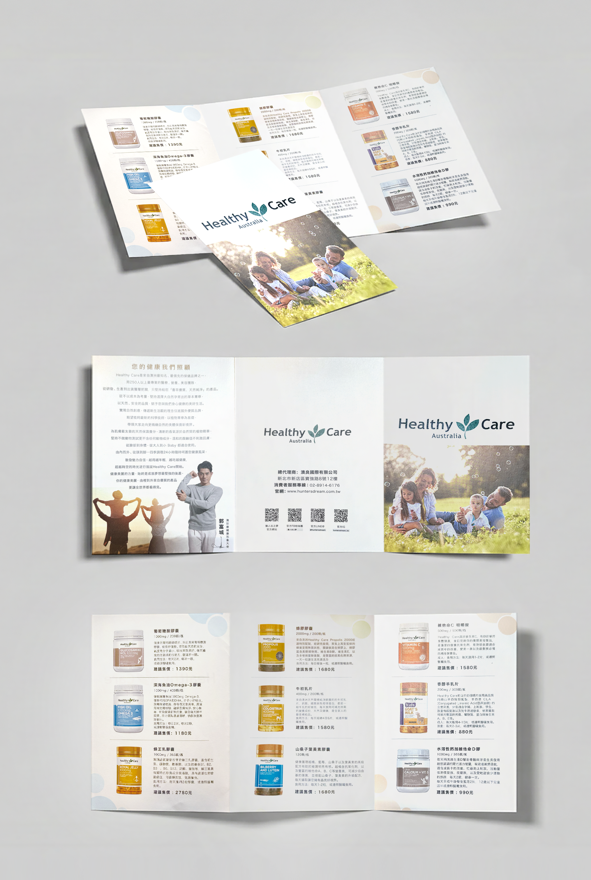
Brochure design
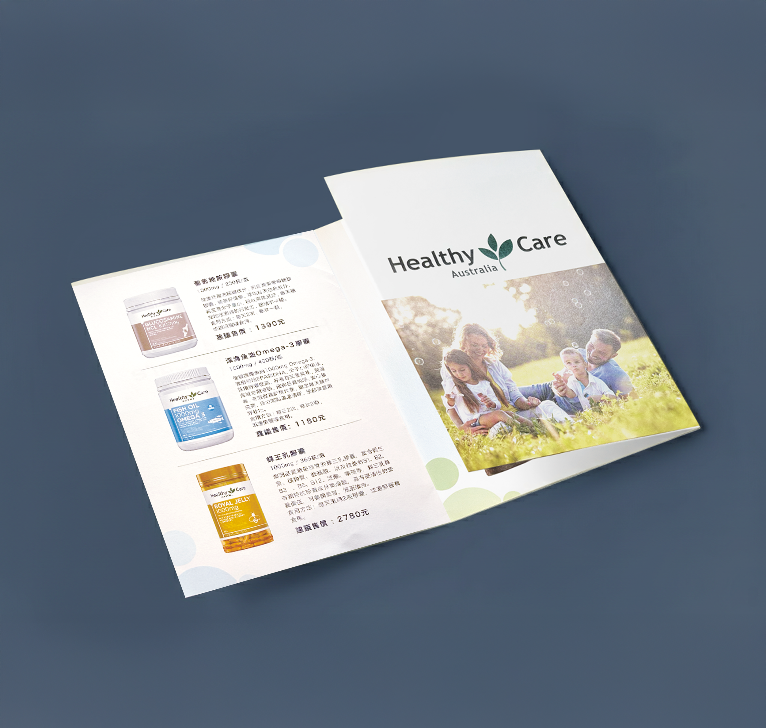
The cover features a sunlit family scene, precisely capturing the local audience’s aspiration for an ideal lifestyle. Information hierarchy for best-selling products was reorganized for clarity. The overall color palette combines warm off-white with the brand’s natural green, and the recommended physical material is textured, eco-friendly paper, fully expressing the brand’s commitment to nature through both visual and tactile experiences. Following the visual guidelines of the Australian headquarters, the design successfully achieves localized communication.
This tri-fold brochure helps the brand establish a professional yet approachable presence in physical retail channels, effectively increasing consumer inquiries and embedding the core message of “Natural Care from Australia” in the market.