Brochure Design for an Estate-Quality Olive Oil Brand.
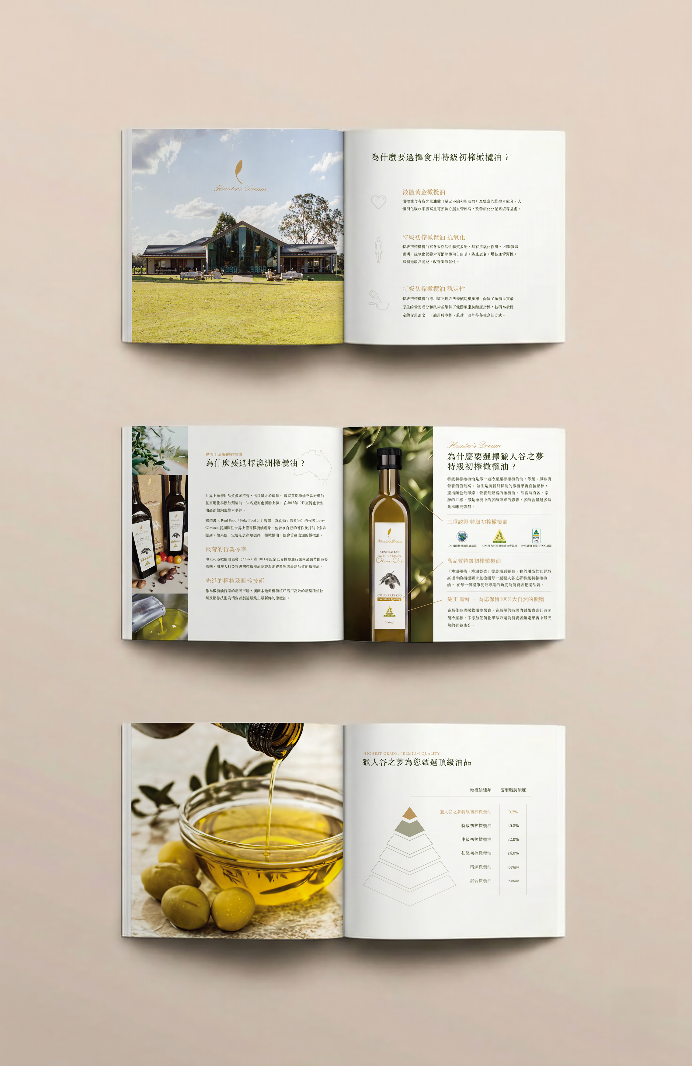
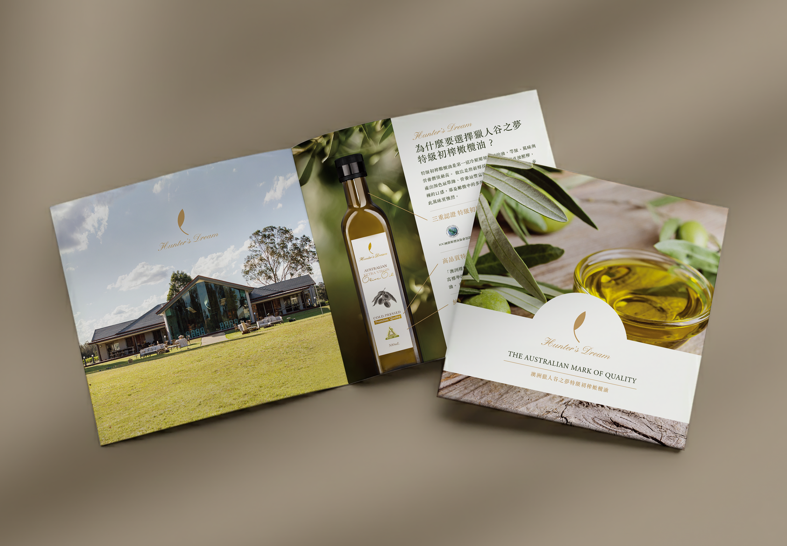
When developing the brand brochure for the Australian estate brand Hunter’s Dream, the key challenge was to balance the emotional appeal of “estate-to-table origin” with the credibility of data-driven quality assurance. The visual direction centers on nature, purity, and professionalism, using generous white space and a restrained color palette to evoke the calm and expansive atmosphere of the Australian estate landscape.
High-quality lifestyle and on-site photography play a central role in the narrative, from wide shots of the estate to close-up textures of the olive oil itself. These visuals not only enrich the aesthetic experience, but also communicate the brand’s commitment to freshness: olives harvested at peak ripeness and cold-pressed within hours.
To avoid the dryness often associated with agricultural product information, technical specifications and acidity data are translated into clean charts and progressive step diagrams. This visualized approach transforms complex information into an intuitive and persuasive reading experience, allowing consumers to understand quality standards at a glance while maintaining the brochure’s refined tone.
Classic serif typography was selected to create a balance between the timeless character of a traditional estate and the precision of modern craftsmanship. Through a combination of rational visual structure and emotive imagery, the brochure positions Hunter’s Dream as a benchmark for premium extra virgin olive oil, conveying the purity and integrity of its Australian origin.
Brochure design