Packaging Design for an Australian Botanical Essential Oil Brand.
Hunter’s Dream is centered on conveying the value of 100% natural, chemical-free botanical essential oils sourced from Australia. The visual strategy carefully balances “nature” and “luxury,” translating the essence of the Southern Hemisphere’s forests into a refined and understated design language. By eliminating excessive ornamentation, the overall aesthetic embraces a quiet sophistication, allowing the product to deliver a sense of therapeutic calm while expressing the premium quality of Australian origin through thoughtful packaging details.
Packaging design
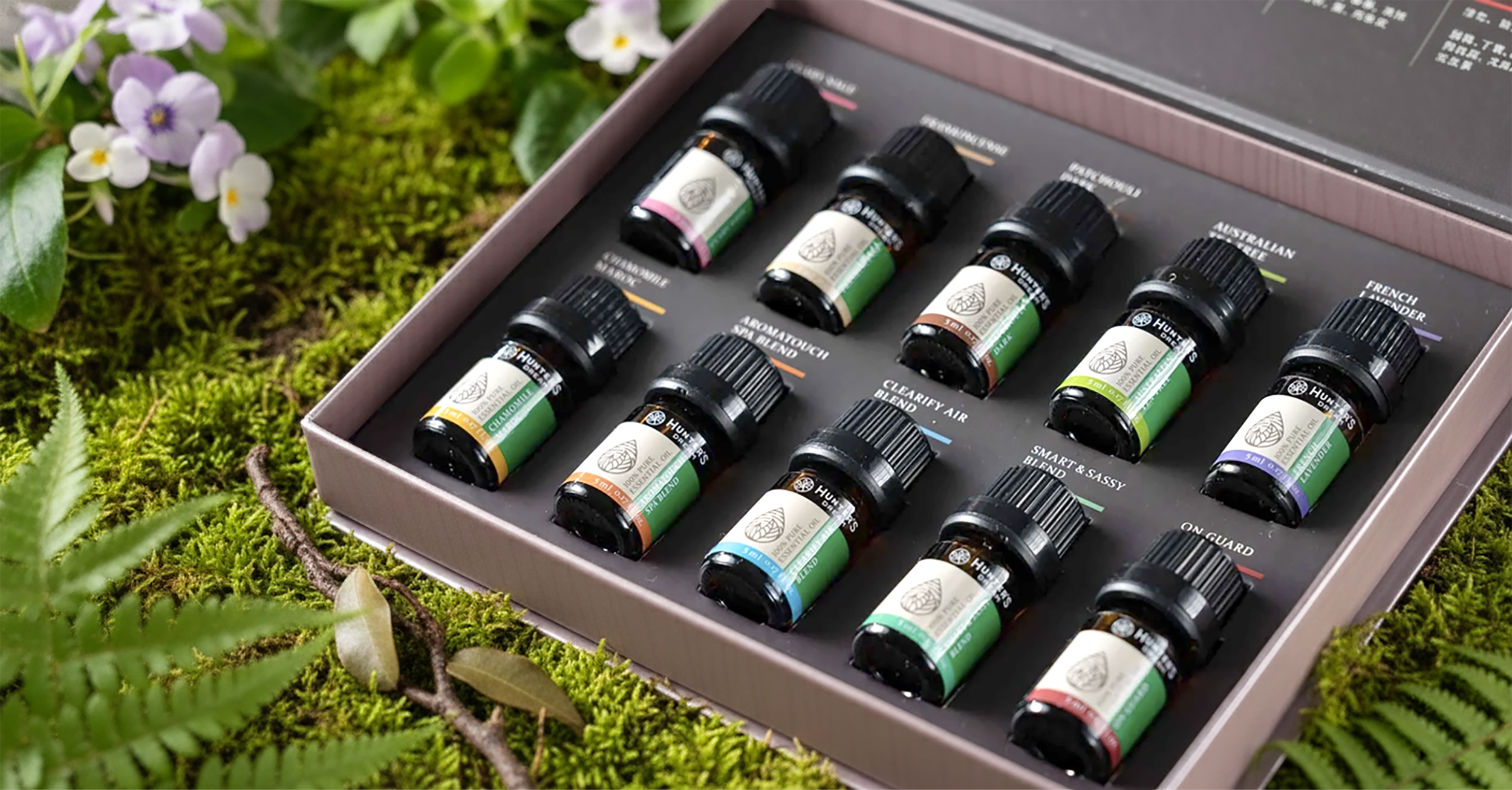
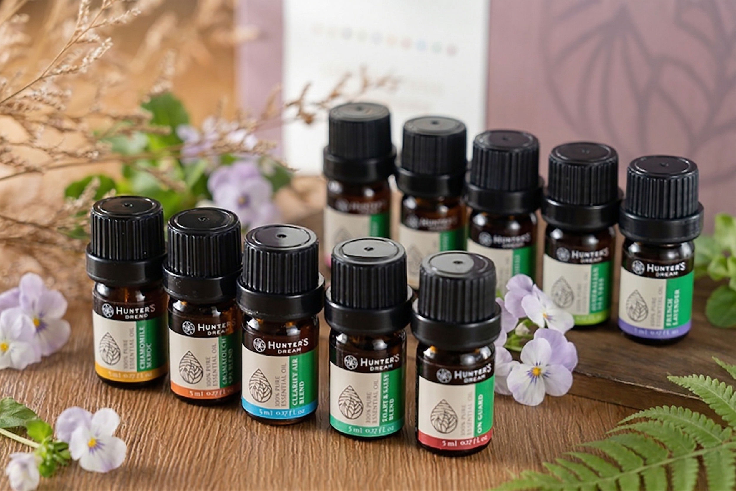
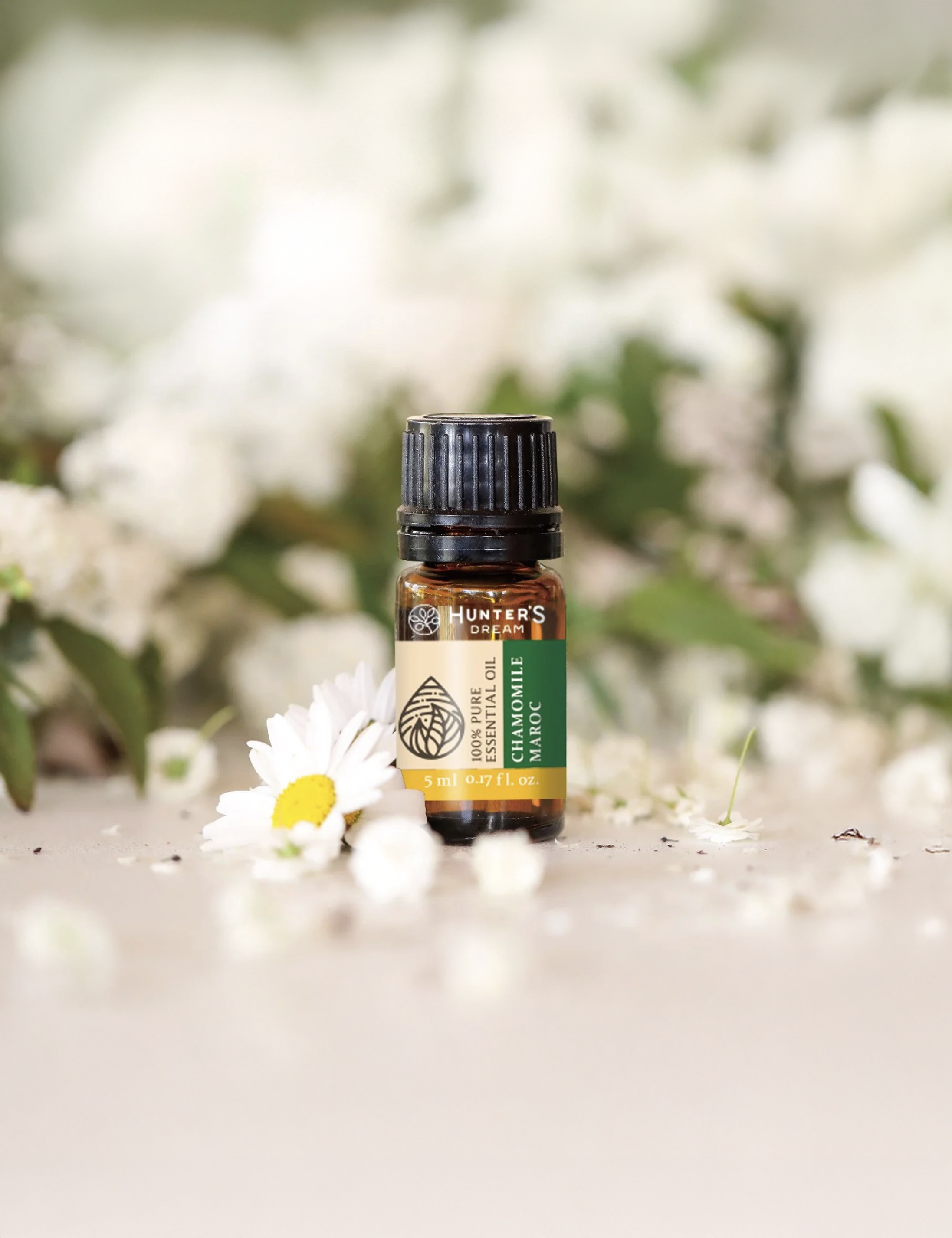
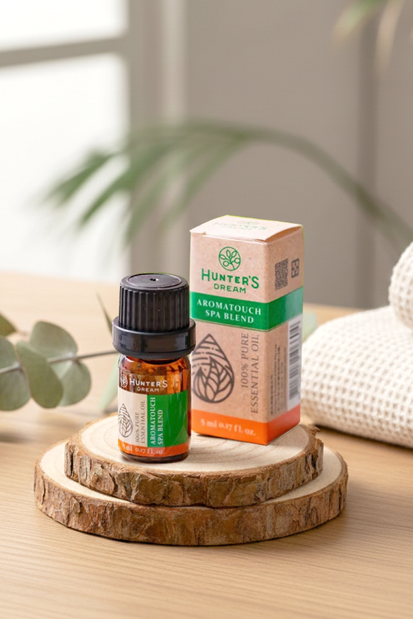
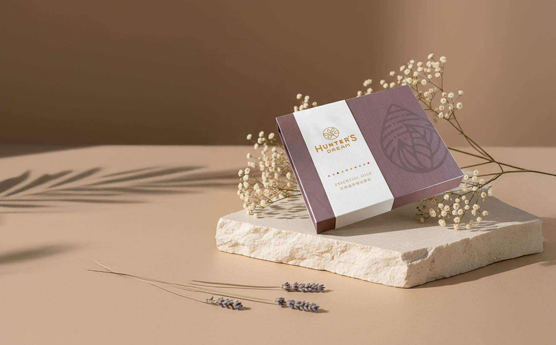
Across ten essential oil variants, the packaging system introduces a structured color identification logic. From single oils to blended formulations, each scent and function is translated into a distinct color palette, enabling intuitive sensory associations and simplifying the selection process. Material selection further enhances the experience, with both individual boxes and gift sets crafted from tactile fine art paper, complemented by gold foil stamping and embossed detailing. As light interacts with the surface, subtle layers emerge, creating a cohesive and elevated sensory experience from exterior to interior.